Quest App
A resource-sharing platform for college students to securely and intuitively save money.
Many services and resources can be more affordable per person if more people buy into the resource. For example, Ubers are less expensive with more people, as are bulk groceries or family plan subscriptions. However, some university students don’t always know who else they can split things within a timely manner.
Our concept would connect fellow students with each other so they can split the cost of resources without needing a robust social network.
Quest is a resource-sharing platform for college students to securely and intuitively save money.
About
UX Designer
User Research, Visual Design Prototyping & Testing, Design System
Role
Tools
Miro, Mural, Qualtrics, Figma
Timeline
January 2023 - May 2023
Process
1
2
3
4
5
Empathize
It all started at the airport.
Students on the same flight to Detroit needed to get back to campus outside the bus time, but none knew each other.
… so they each paid for separate Ubers.
Motivation & Preliminary Observations
Upon moving to a university campus, students have limited time to build their social network. Even with this, many students struggle with finding and sharing resources with their peers. With the amount of resources available (e.g. gym memberships, furniture, grocery trips, airport trips, etc.), students look for ways to find these services and share their own services with other peers at a lower price. However, many students struggle with forming connections and feeling comfortable with sharing their resources.
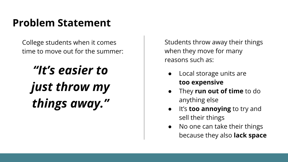
In another example, students often dump their things (e.gg., furniture, textbooks, home goods, etc.) when they move at the end of a school year as they deem those are either worthless to them, have difficulty transporting those goods, or don’t have the time to sell the item. This creates a cycle of students buying items for housing, then dumping them once they move out, thus contributing to more waste in landfills.
Problem Statement
How might we help students save money by facilitating resource sharing amongst students with similar goals? We believe that for our solution to be effective, it should fit the following criteria:
It is trustworthy and secure
It is relatively cheap
It is low-effort and intuitive
Target Audience
University students who are looking to split costly resources to save money and:
Have a limited social network to share resources with
Live on or near campus
Define
Competitive Analysis
I conducted a competitive analysis of 11 competitors, including Nextdoor, Task Rabbit, Facebook Marketplace, and Craigslist. For each competitor, we look at the following criteria:
UX/UI helpful features and opportunities areas
Size of items sold (smallest & largest)
Security & privacy
How they build trust between buyer & seller
Info needed from buyer & seller
These online services were chosen because they are all resources where goods and services are offered locally. In addition, each website has a distinct method of connecting buyers and sellers.
Interviews
The team conducted 8 interviews with college-aged students, from both undergraduate and graduate programs. Through analyzing the interviews through an affinity wall, we boiled down the main points:
Trust is the most critical factor that makes or breaks a cost-splitting effort
Initiating a cost-splitting among different parties requires a lot of effort that deterred some people from doing it at all
Security concerns regarding money through digital means
“People in group chats are local people that live here and work/study here. Because of this, I can trust them.”
“I would rather join someone else’s cost-splitting opportunity, than initiate one myself.”
Surveys
From our surveys, the team found that safety is the most important concern. Half of the students said they are more likely to share costs with their friends. Among the students who do not cost-split, the primary reason is “no opportunity to do so,” indicating a gap in students’ ability and willingness to find cost-splitting opportunities.
How often do you take a trip via rideshare with at least one other person?
Why do you not split the cost of items/services with others?
Who do you share costs with?
Key Findings
Our team organized our research findings into an affinity board, which we boiled down into key learnings:
Users don’t want to make the first move when initiating and coordinating deals
Users want as little personal interaction as possible
Users are only interested in sharing costs when it will save them a lot of money
Saving money is not worth it if it takes too much time


Ideate
Ideation
In order to create empathy maps and personas, we first listed out traits of our target user group based on our findings from the affinity wall. Through this process, we realized that we can create two personas to encompass our users:
Deal-unaware student that doesn’t have the network to split costs with others
Deal-aware student that seeks out cost-splitting opportunities

List of traits of target user group organized by color: red for deal-unaware, green for deal-aware, and yellow for both.
Empathy Maps
We created empathy maps to explore the feelings and thoughts of these two personas.


User Personas
From the empathy maps, we crafted user persona details from the two distinct user groups we are targeting: deal-unaware and deal-aware. From these traits, the team was able to focus on features in our design solution that can mitigate the concerns of our target user group.


System Criteria
Based on our analysis of user research, we refined our design concept accordingly:
Only verified students can become users
Users can only communicate with the app and not other users
Design both a mobile app and web platforms
Brainstorming & Feedback
Amongst our teammates, we brainstormed ideas on the best way to support students in sharing resources with other students. We presented our main ideas for classroom feedback 3 times during our project timeline, so that we could boil down the most important parts of our design solution.
Final Idea
After receiving feedback, our team decided on our final design solution.
A platform that facilitates cost-splitting by matching students who have similar needs.
The team created storyboards to show two scenarios of students using our design solution.


Design Metaphor
In order to have a clear mental model for our users to navigate through our solution, the team decided that our design metaphor is that of a quest. Students start a quest inviting other students to join their journey to share resources and save money.
Prototype
Feature Inventory
Upon deciding on our final idea, we developed a list of features that would be part of our design solution:
Onboarding with university verification
Home feed with quests from nearby students
Filter, sort, and search through quests
Create a quest
Quest library with saved quests, my quests, and completed quests
Profile page with student info
Alerts & notifications
Whitelist terms for search & notifications
Settings page
User Flow
Based on the feature inventory, I created a user flow of the paths that can be taken.

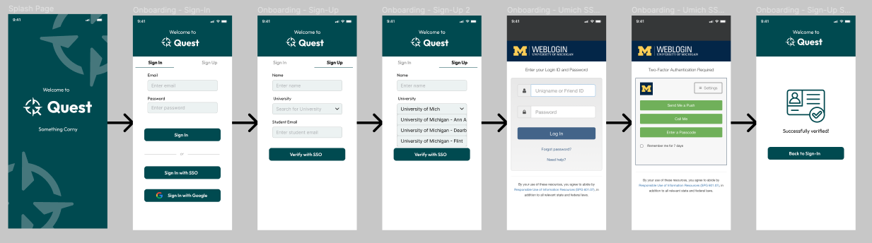
Designing the Interface
The team spent 3 weeks designing our prototype, starting with rapid prototyping sessions to flesh out ideas into low-fidelity interfaces and features, then chose the top ideas. From here, we created a mid-fidelity prototype with basic functionality, then added high-fidelity elements in preparation for usability testing. From here, we developed our first iteration of the prototype (user flows shown below).


Test
Usability Testing
We conducted two rounds of usability tests. The first round of usability tests focused on basic interactions, testing the overall flow of the prototype and how this impacted the trustworthiness of the solution. This included testing the information architecture of the design solution, making sure where quests are found and stored makes sense to first-time users.
The second round of usability tests honed in on the specific design choices we made and how we could improve these. This involved testing the design of the quest cards, interface to create a quest, and other elements of the design solution.
We learned that students prefer a simplified experience, where cost-splitting opportunities are listed as a dashboard. We also focused more on the overall story that we wanted our solution to convey.


Design Criteria
For the design solution, our team focused on the following criteria:
Trust - only verified students can utilize the app & transparency about how costs are split
Low-effort - limited effort required from student for input fields & coordinating logistics
Accountability - customized cancellation policies design to discourage flaking
Efficiency - only relevant info is included to ensure frictionless cost-splitting
Before
First iteration of design solution
After
Last iteration of design solution

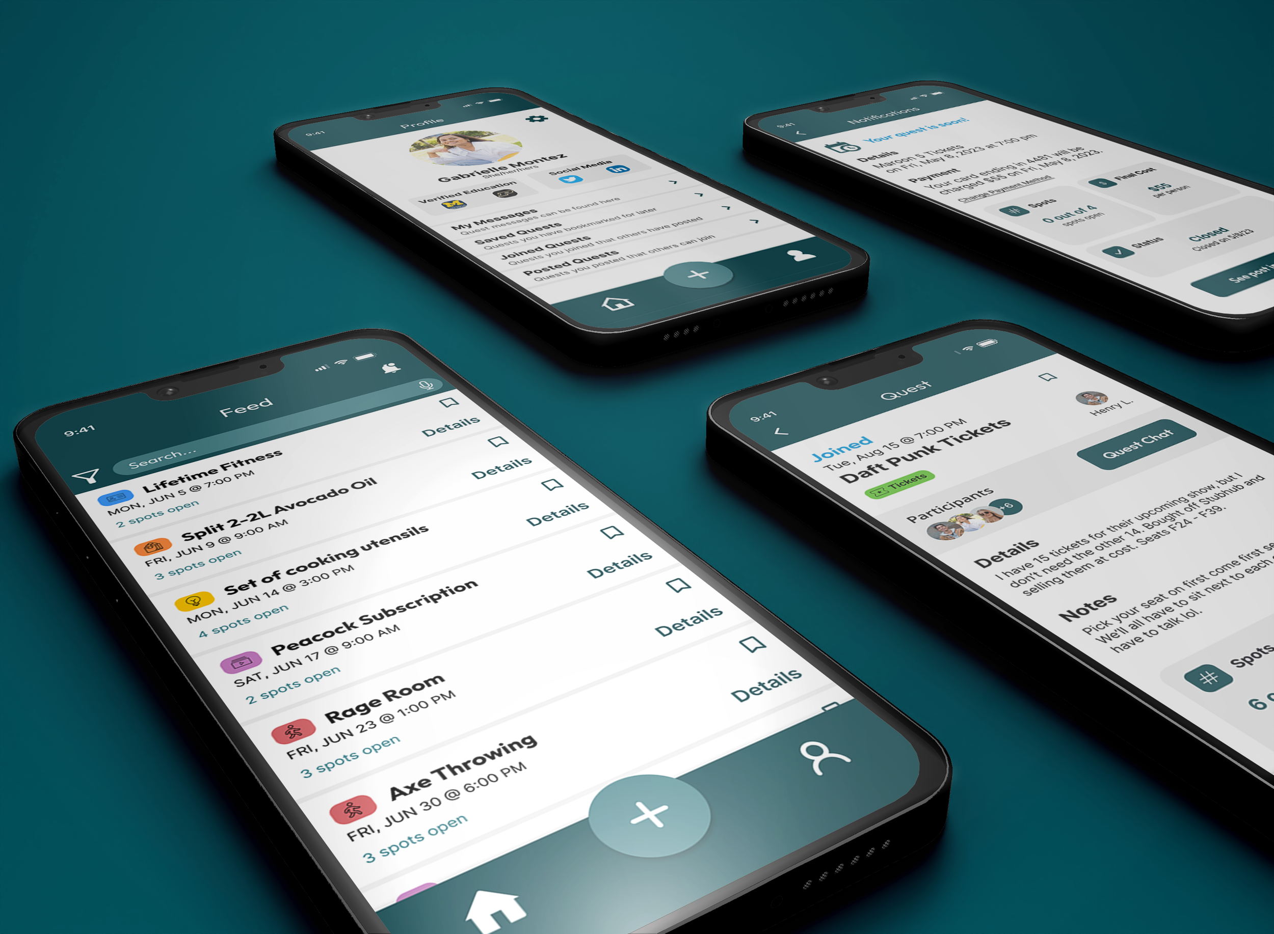
Quest App
Student sharing made easy
We coordinate cost-sharing opportunities called Quests for busy students who want to save money.


Browse quests posted by fellow students in the area

Join quests where everyone knows what to expect

Can't find a quest you want? Post your own!
Design System
I composed a design system to support the narrative of our solution, which is an exploratory quest that students can go on with others to share resources.
The logo is a magnifying glass inlayed with a compass, representing a journey or quest. The two symbols inform the user that this design solution can guide them in finding quests (cost-splitting opportunities).
All typography is sans-serif to offer a casual and trustworthy experience. Titles and headings use the Outfit typeface, with its symmetric and simple offering a clean, inviting experience. Body text and labels utilize the Inter font family, which has high readability and creates the tone of a professional, legitimate system.

Demo Walkthrough
Create a quest
Quest library with saved quests, my quests, and completed quests
Profile page with student info
Alerts & notifications
Payment and setting pay card
Settings page
With the design criteria in mind, the feature inventory of the Quest app that you can walkthrough on the demo (left) is as follows:
Onboarding with university verification
Home feed with quests from nearby students
Filter, sort, and search through quests
Learnings
Throughout our project, our key learnings came from two main questions.
Privacy vs. Trust: What is the ideal amount of personal information users need to feel trust, while maintaining their privacy?
One of the main factors of our design solution is to create a safe environment where students can build their network of trustworthy resource-sharing. From interviews to usability tests, users shared their concerns with how much personal information is shared with quest mates. Due to this, we prioritized collecting only pertinent data from users, including payment info saved from a credit card or external payment applications (PayPal, Venmo).
In order to build trust, we suggest students share some personal information on their profile page, such as a picture of themselves, education history (with current college verified), and social media that they’re comfortable sharing (LinkedIn, Facebook, Instagram). In this way, students can get an idea of who is joining their quests or who is hosting quests, adding a sense of reliability without sharing heavy personal information.
Accountability vs. Freedom: What is the best way to limit last-minute drops from Quests, while ensuring students have the freedom to change based on their busy schedules? Students want to feel protected when they are creating quests that others can join. In the same vein, students want freedom when joining quests, so that they are not penalized for dropping from the quest. To mitigate this, we explored many solutions, but landed on having cancellation policies based on the type of quest. While we provide a suggested cancellation policy for each type of quest, students are able to choose their cancellation policy when creating the quest.
For event and activity quests that need to be purchased beforehand, we suggest a more strict cancellation policy with a few days’ worth of flexibility with a small fee penalty. For quests where students are sharing items or grocery trips that do not require payment beforehand, we suggest an open cancellation policy where members can cancel with no penalty.
Want more information?
Presentation
Check out our final presentation, which showcases the purpose of the design solution and details the benefits.


Project Brief
Our project brief includes every detail from our design process, from start to finish.